Responsive design is a content decision
The strongest responsive work begins before CSS breakpoints.

Responsive design is not the act of shrinking a desktop page. It is the planning of content, layout, controls, media and performance so people can complete important tasks across phones, tablets, laptops, large displays and assistive technologies.
Responsive design is not the act of shrinking a desktop page. It is the planning of content, layout, controls, media and performance so people can complete important tasks across phones, tablets, laptops, large displays and assistive technologies.
The strongest responsive work begins before CSS breakpoints.
Modern responsive layouts use flexible grids, relative units, intrinsic sizing and components that adapt to available space.
Responsive typography balances line length, font size, spacing and hierarchy.
A large desktop image should not automatically be sent to every phone.
Menus, filters, forms and dialogs need more than a compact appearance.
Mobile users may have powerful phones but unreliable networks, battery constraints or data limits.
The strongest responsive work begins before CSS breakpoints. Teams decide what matters most, which actions must remain easy, how content should reflow and what can be progressively disclosed. A clear hierarchy makes the same page useful in a narrow viewport and a wide one.
The purpose is not to add process for its own sake. The purpose is to make decisions visible, reduce avoidable risk and build a result that remains understandable after launch. Teams should document assumptions, assign ownership and verify the experience using real tasks rather than relying only on a tool score.
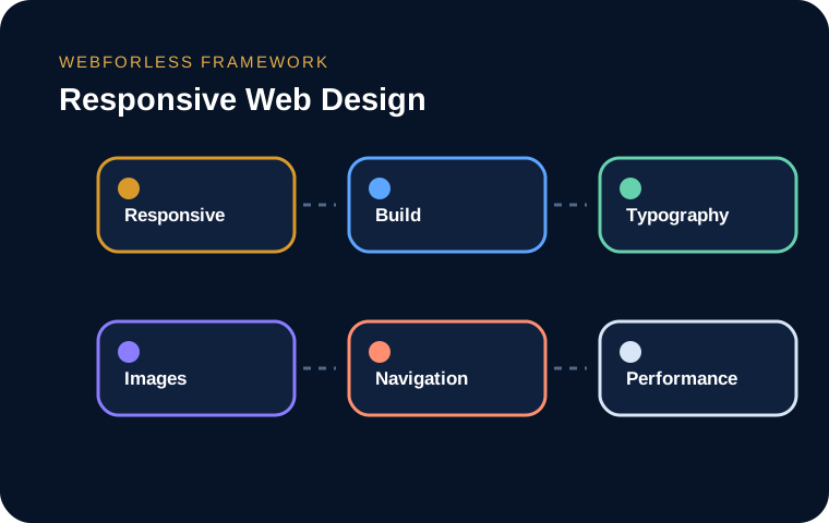
Modern responsive layouts use flexible grids, relative units, intrinsic sizing and components that adapt to available space. Breakpoints should respond to content pressure, not a list of popular devices that will soon change.
The purpose is not to add process for its own sake. The purpose is to make decisions visible, reduce avoidable risk and build a result that remains understandable after launch. Teams should document assumptions, assign ownership and verify the experience using real tasks rather than relying only on a tool score.
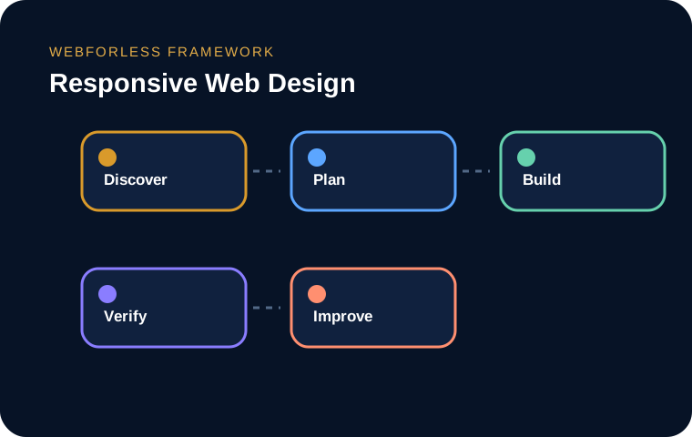
Responsive typography balances line length, font size, spacing and hierarchy. Very small text may fit but becomes tiring. Very large text can dominate a phone. Fluid sizing can help, but it needs sensible minimums and maximums.
The purpose is not to add process for its own sake. The purpose is to make decisions visible, reduce avoidable risk and build a result that remains understandable after launch. Teams should document assumptions, assign ownership and verify the experience using real tasks rather than relying only on a tool score.
A large desktop image should not automatically be sent to every phone. Responsive images, modern formats, explicit dimensions and appropriate cropping improve speed and stability. Art direction is useful when the subject would be lost in a narrow crop.
The purpose is not to add process for its own sake. The purpose is to make decisions visible, reduce avoidable risk and build a result that remains understandable after launch. Teams should document assumptions, assign ownership and verify the experience using real tasks rather than relying only on a tool score.
Menus, filters, forms and dialogs need more than a compact appearance. Touch targets require space, focus must remain visible, keyboard operation must work and labels must be understandable without hover.
The purpose is not to add process for its own sake. The purpose is to make decisions visible, reduce avoidable risk and build a result that remains understandable after launch. Teams should document assumptions, assign ownership and verify the experience using real tasks rather than relying only on a tool score.
Mobile users may have powerful phones but unreliable networks, battery constraints or data limits. Responsive design should reduce unnecessary scripts, avoid oversized media and load the critical experience quickly.
The purpose is not to add process for its own sake. The purpose is to make decisions visible, reduce avoidable risk and build a result that remains understandable after launch. Teams should document assumptions, assign ownership and verify the experience using real tasks rather than relying only on a tool score.
Browser resizing is useful but incomplete. A practical matrix includes narrow and wide viewports, portrait and landscape, touch and keyboard, zoom, text enlargement, slow connections and real devices. Test pages with long names, errors and unexpected content.
The purpose is not to add process for its own sake. The purpose is to make decisions visible, reduce avoidable risk and build a result that remains understandable after launch. Teams should document assumptions, assign ownership and verify the experience using real tasks rather than relying only on a tool score.
Use these prompts during planning, review and launch. The downloadable guide expands them into worksheets your team can complete.
The tools and terminology keep changing, but the strongest projects still begin with a clear purpose, understandable ownership and respect for the person using the website. A fashionable technique cannot rescue weak information architecture, fragile implementation or unclear responsibility.
Use the printable workbook to document decisions, risks, responsibilities and verification steps before and after launch.
It is a structured approach that aligns technology, content and business requirements rather than treating one isolated feature as the whole solution.
It is important, but it should be evaluated as one part of a complete system rather than a stand-alone guarantee.
The decision should follow risk, value and operational capacity rather than a universal rule. Test critical journeys and preserve a rollback path.
Start with evidence and priorities, implement the smallest coherent improvement, verify the result and keep an ownership plan for future change.
Start with evidence and priorities, implement the smallest coherent improvement, verify the result and keep an ownership plan for future change.
It can influence visibility, usability or reliability, but results depend on implementation quality, competition, user needs and the wider website system.
It is a structured approach that aligns technology, content and business requirements rather than treating one isolated feature as the whole solution.
Yes in many cases, provided the existing platform, content and ownership constraints are understood before changes begin.
Connect this topic with the wider website system.
Continue learningConnect this topic with the wider website system.
Continue learningConnect this topic with the wider website system.
Continue learningConnect this topic with the wider website system.
Continue learningConnect this topic with the wider website system.
Continue learningConnect this topic with the wider website system.
Tell us what the website or system needs to accomplish, what is currently getting in the way and which risks matter most.